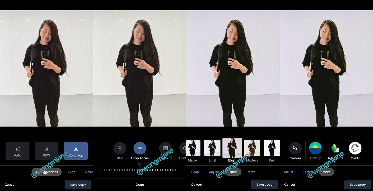
Google Photos is testing a new editor UI with larger buttons
Google Photos appears to be testing a new editor UI, with larger buttons that will make it easier for users to edit their photos. The service previously received a big redesign over the summer that didn’t overhaul the editor UI. The changes were discovered by Jane Manchun Wong, who has a reputation for reverse-engineerings apps and uncovering features that are in development.
Right now, the editor UI in Google Photos looks like what you’d find in Snapseed or Adobe Lightroom, with sliders for settings like exposure, contrast, etc.

Old Editor UI
The redesigned UI features large buttons with a slider below, which can be used to make fine-tuned adjustments. It looks a lot like what you’d find in Apple’s stock Photos app on iOS. The controls are much easier to understand and are more user-friendly. Ultimately, offering tools that are easier to use will encourage Google Photos to edit their photos right inside the app. Users can save a copy of the photo they’re editing so the original stays intact. Of course, if you do want to use another app, the revamped editor UI appears to feature quick access to other photo apps, including Snapseed and VSCO Cam.

New Editor UI
It’s unclear when the new editor UI will become widely available in Google Photos, but it looks like a welcome change, offering a cleaner, easier to understand layout.
Google Photos is working on a new editor UI pic.twitter.com/GAK4NQCsIB
— Jane Manchun Wong (@wongmjane) August 25, 2020
Google Photos (Free, Google Play) →
The post Google Photos is testing a new editor UI with larger buttons appeared first on xda-developers.
from xda-developers https://ift.tt/3lnju0f
via IFTTT
Aucun commentaire: